Friday, September 23, 2011

White, but not quite right...


Have you ever tried looking up advice online about picking paint colours? Let me tell you, there are a lot of tips out there! However, it's fairly well-accepted that this is one of the most difficult steps in decorating and you really have to be in the exact space with the exact chips/samples to make a final call.

This time, I thought I'd try out the new(ish) line of Sarah Richardson paint colours offered through Para. If you're a newbie to this sort of marketing, the plan is that the famous designer picks out their top colours from a paint line and they are sold sort of as a feature set. So, if you like a particular person's style, you can get their look by choosing their top colour picks from the line fairly easily. It can make the job of looking at a full range of tints much more approachable.

Here is a clip of SR talking about her line and the process of picking colours:


Did anyone else catch the Christie Mansion in the 
background for the Tommy Smythe comments here?

The truth is that most people get paint colours wrong and that includes even the real super-star designers. (I don't have the clip, but there are even scenes on TV where the illustrious Sarah Richardson realizes she's got a miss!)

Our goal was to pick out a creamy white for the office. Something like this: 


I may also mention that Benjamin Moore alone has 160+ shades of white, so it's not an easy colour to get right!

This is what I picked out:
Sunbeam


  • Sunbeam
  • Paint Code
  • SR45
  • Sarah's Advice
  • Sunbeam is a toasty white that can be used to warm a cooler palette.


And this is how it turned out on my wall:


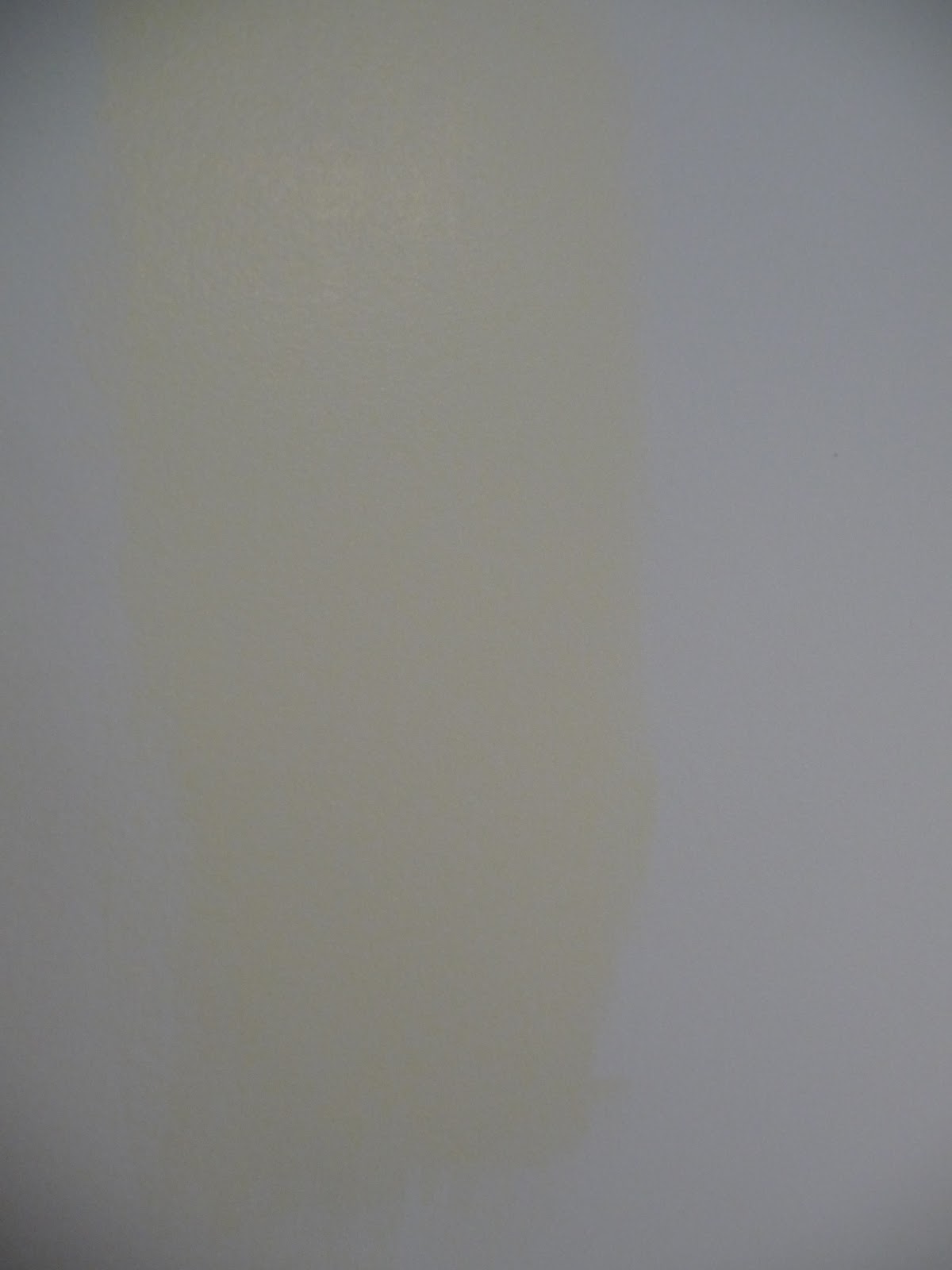
(The photos are quite dark, but you can hopefully see how golden yellow this turned out!)

Quite a bit more yellow than expected. 

What went wrong here? I mis-judged my own instinct to go with something that looked paler and muddier on the chip and took this one at the suggestion of the paint rep at Lowes - who did also admit that she herself had never worked with these colours. (Mistake #1! Never take product advice from someone who has never used what they're selling you!)

So, loyal reader, what can you do if the same thing happens to you? If you have a reasonably good understanding of how colours work, you can almost always have a gallon of paint re-tinted. What I did was request a small shot of brown tint to tone down the yellow and a few shots of white to pale the colour and reduce the saturation. The end result looks like this:

Even with daylight and overhead lighting, this room is still dark and the shade
 came out more "french vanilla" or yellow than creamy white.

I'm not 100% happy, but we'll see if we can work with it once furniture goes in. What do you think?

The lucky part is that the actual painting is the easy step and our hard work prepping the walls won't have to be repeated in order to adjust the final look of the room. 

DIY Rating: 6

It takes time and practice to master the art of choosing paint colours. 

Look for an experienced sales person at the store 
to help give some suggestions on good tints 
AND 
to offer their expertise in re-tinting your choice in case it doesn't work out!


Saturday, September 17, 2011

New, but not you?


We're all used to TV shows and renovation blogs where we see horrible images of dated wall coverings and green shag carpeting being ripped out and painted over in order to create something non-offensive, reasonably updated and boring that will easily sell on the real-estate market. 

But what happens if you buy one of these houses and the decor just isn't you?

That's kind of what happened to us in our last move.

The choice was between a house that hadn't been updated AT ALL since 1975 - I'm talking museum worthy kitchen, green shag and a lot of original (expensive to replace) fixtures - and a house that had been through quite a bit of upgrading since 1975, but still needed a bit of coaxing to fully bring into the 21st century.

While we decided against a major reno project and took the fixed up house, a lot of the decor choices that the previous owners made fall into the category of "Home-Depot Decor." Not to say that the Depot is a bad place, it's just that it's kind of overpowering when you make all your decorating choices at one store. What I'm talking about here is a lot of brushed nickel and dark, taupey-brown paint. (ok, I have found quite a bit of Canadian Tire decor in here too, but you get the picture!)

Back in 1989, my parents bought a house that had also been newly decorated. It was awful, but because it was new, they kept the bizarre wallpaper up and decorated around it. I hated it, but they refused to rip it out.

Do you change it even though it's in good shape? We were dealing with a dark, olive-green in the office, which has very little natural light. Though I love all those images of dark, moody rooms in Elle Decor, somehow, it just doesn't work as part of the 1970's architectural aesthetic. 


Dark looks good when...high ceilings, large window, use of mirrors and white rug/furniture/mantel piece

Sadly, I have 8ft ceilings, small window and dark furniture!
After a month, I decided to bite the bullet and start priming it out. My save-a-dime instincts rebel at the thought of re-painting a freshly-painted room BUT sometimes, there are colors (like dusty rose in that 1989 kitchen) that just cannot work.

(This is my second attempt at priming over dark green and let me tell you, it's a pain in the A**!)

Here are the "before" shots:


Way darker at night - these were daytime with all the lights on and using flash!

I'm hoping that I will like the finished product more than what we had and still not fully decided that I made the right choice to change this out, but maybe there was a reason that this was the only room not included in the online sale photos?

If you're thinking about a dark color like this, my suggestion would be to seriously consider whether you have the architectural details in place - like windows and higher ceilings. Our window is covered by the porch, so the light is very filtered.

Secondly, this type of green works well as an accent colour - let's say, like above white wainscot or around a wall with cream/off-white cabinetry. Four, full-sized walls was way too much of a good thing!

Finally, the person who picked this paint should also have aimed a few shades lighter to get the cozy, saturated feel they were looking for that was still green - paint always looks darker on the walls and this one was verging into black in the evening.


DIY Rating: 5
About the same amount of work to "live with it" 
and decorate around something I didn't love 
as the work involved in changing it right off the bat.

Still wish someone else was doing the painting work for me though!