Sunday, October 23, 2011

Brown-out!

Muddy Bath in Guilin Shanshui

This is pretty much what it feels like in my living room. For that matter, in my dining room, family room, kitchen, stairwell and basement! Yes, my whole house is painted in various shades of dark brown. 

At first, I kinda liked it. It looked pretty good when I viewed the house before buying it. But, after a couple of months of living here, I'm feeling like it's really getting under my skin. Part of the problem is that a lot of our furnishings are wood, our flooring is honey-oak and every time I like a photo in a design magazine or blog, the walls are a shade of off-white.

I've been speaking to a few different design folks and they agree with me that for some reason, brown is a very, very popular colour in Regina. Even the "Fine Living" magazines here featuring million-dollar homes show most rooms painted in brown. I'm not sure I get it.

So, after our last White, but not Quite Right adventure, we've decided to return to Sarah Richardson's palette and give this one a try as an overall main floor living colour:


Paint Name
  • Bisque
  • Bisque lends a softening effect when applied to cabinetry as an alternative to bright white.


We're only one coat in, but so far, it's coming out as a nice, soft, warm white. Photos to come!

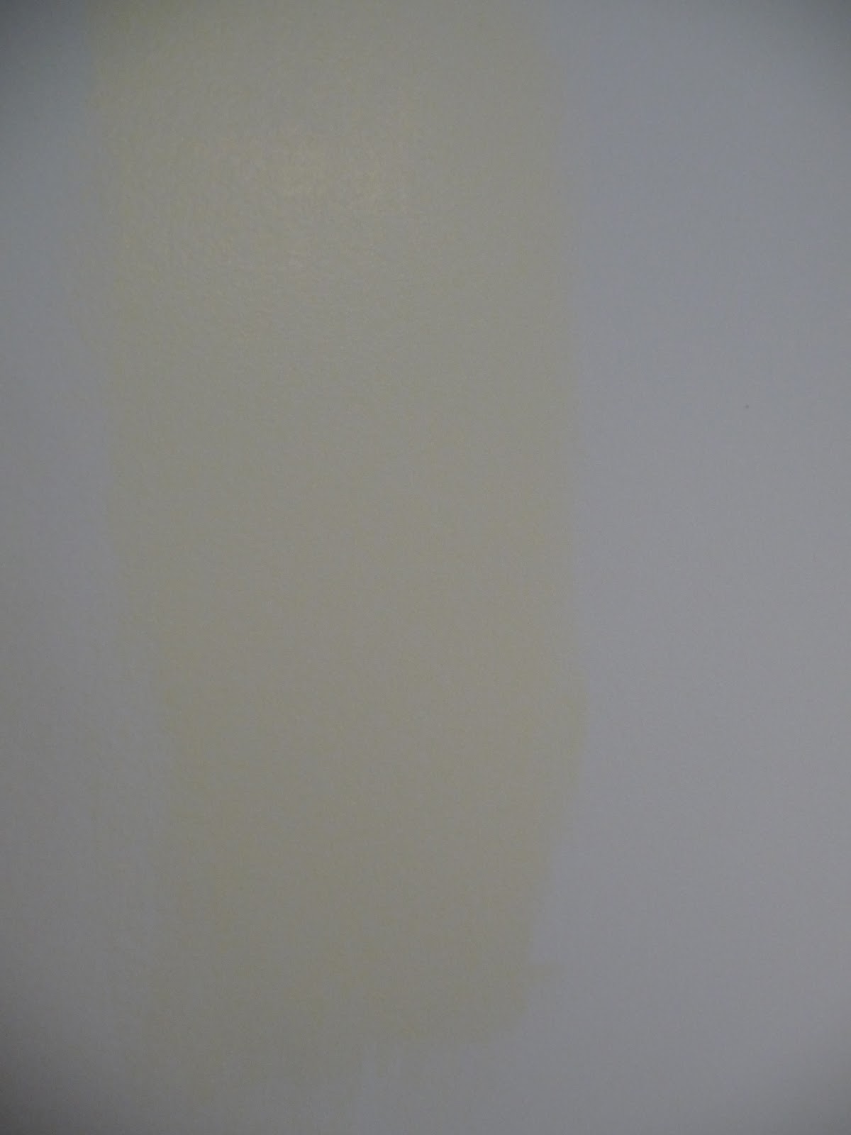
I should also share that it was a bit of a mishap that led to this choice... We started out with Benjamin Moore's White Dove but when we put some samples on the wall, it didn't look at all right. After some thinking, I discovered that the chips have a date code on the back and the chip we'd chosen was produced in 2001 - it had yellowed over time! With a fresh chip, we realized the sample was in fact the correct colour (and was also too stark for me). This was a good learning experience!

DIY Rating: 10 for testing out sample pots before buying 
(I'm learning my lesson after two failed attempts at white!)

As for my colour choice...I'll let you decide once the before and after photos are ready!

Wednesday, October 19, 2011

Shop'n DROP!

Sophia Loren in her bedroom


Do you ever buy your furniture in sets?

What's strange is that most furniture showrooms are designed to show shoppers a full matching suite for each room, but real-life professional designers never buy furniture that way. If you take a close look at design magazines or tv shows, they way that they put rooms together looks good because they use an eclectic mix of pieces that work, but don't match. You won't often see anything that looks like a furniture showroom in Canadian House and Home!


It's this kind of matchey-matchness that makes
this site so hilarious to look at!
Image via Catalogue Living


However, dear reader, do not be deceived into thinking that look this is easy for us mere mortals to achieve! There is a unique talent at work in creating a certain unique and seamless looking decor. I've recently decided that the reason it's such hard work is that one must be an expert shopper in addition to having a flair for colour and space.

Image via HGTV.ca (Sarah's House Season 4)

Just to get a sense of what I mean, take a look at the shopping guide for the new Sarah Richardson House Season 4 main living room here.

It's amazing the number of different stores and fabrics and paint colours that she sources for the room and is able to manage and pull together for a seamless look. I sometimes get overwhelmed in just one store trying to pick just one item - it gives me a new respect for what a designer is able to manage in their mind's eye.

Some of the tricks that I've heard of and/or used are to put together inspiration boards and to shop slowly and accumulate things you love over a longer period of time.

I've recently started an account with Pinterest to try to organize my thoughts and save digital images of what I like. It's frankly a lot of fun. I want to find a use for it in business by saving images of great marketing pieces that I see online and in real-life - still need to get around to that...


On the tv shows about decorating, like Sarah's House, it appears that they are working in a linear fashion and decorating the room in one shot, start to finish, in about two weeks time. Maybe you can do that if you're a superstar with a great support staff. I suspect what's really happening is that they're shopping out different parts of the house simultaneously and just showing a linear documentation of the process. I think in a regular house, you're going to have a lot of incomplete spaces for quite a while adding bits and pieces to each room as you find things that work. 

So, as you sit in your matching love seat, sofa, chair combination with the slightly too small rug and side tables that match your coffee table, don't fret too much! It takes time and talent to shop out that quintessential eclectic look that is you and isn't as easy as it looks! There are basements and guest rooms and used furniture websites to help you split up those sets and keep only the pieces that work with other things you love.

DIY Rating: 5
Reading the source list for Sarah's living room helps 
one to realize there is a lot of work and talent to pulling together a completed space.

It might be worth bringing in a designer to give some direction to your plans.

Start small and don't be surprised if it takes 1-2 years to create what happens in 30 minutes on TV!


Friday, October 7, 2011

Let's Talk Turkey

External Turkey Roaster via Life.com

Starting tomorrow (and actually, a little bit tonight) your grocery store is going to be a madhouse. Haven't got your wine cellar stocked yet? The parking lot at the liquor store will need traffic police. Sharpen your knives, break out the pie dish, dust off the extra leaves for your dining table, it's Thanksgiving weekend and it's time to whip up the big feast.

Except not for me. 

Don't get me wrong. Thanksgiving is my favourite holiday of the year. I love turkey dinners and I love having a big bunch of family and friends over at my place to celebrate.

With moving only 6 weeks ago, looking after little B. full-time and both of us working, The Do-tique just isn't quite ready for a big holiday production yet. 

That's why we're choosing not to do-it-ourselves this year and opting to leave dinner to the experts instead. You'll find us trying out the Thanksgiving buffet at the Hotel Saskatchewan with another young family that just moved here about the same time that we did. 

Hotel Saskatchewan
No shopping, no prep or cooking or clean up. Lots of time to take naps and walks and have friends over for dessert and maybe even unpack a few boxes.

The other upside? Works out to be considerably less expensive than DIY (especially when you consider labour). The only downside is that you'll be the only one in the office not having a turkey sandwich next Wednesday since leftovers aren't usually included!

Missing all our far-away friends and wishing all my dear readers a Happy Thanksgiving! 

DIY Rating: 0 Sometimes, you just have to choose your DIY battles

When life gets way too hectic, no shame in leaving 
the hard work to the experts and heading 
out to a hotel or restaurant for a holiday meal. 

Most places have special event menus and seating times 
and though things get tight closer to the date, we've always managed 
to find a last-minute reservation when we've needed to.

Friday, September 23, 2011

White, but not quite right...


Have you ever tried looking up advice online about picking paint colours? Let me tell you, there are a lot of tips out there! However, it's fairly well-accepted that this is one of the most difficult steps in decorating and you really have to be in the exact space with the exact chips/samples to make a final call.

This time, I thought I'd try out the new(ish) line of Sarah Richardson paint colours offered through Para. If you're a newbie to this sort of marketing, the plan is that the famous designer picks out their top colours from a paint line and they are sold sort of as a feature set. So, if you like a particular person's style, you can get their look by choosing their top colour picks from the line fairly easily. It can make the job of looking at a full range of tints much more approachable.

Here is a clip of SR talking about her line and the process of picking colours:


Did anyone else catch the Christie Mansion in the 
background for the Tommy Smythe comments here?

The truth is that most people get paint colours wrong and that includes even the real super-star designers. (I don't have the clip, but there are even scenes on TV where the illustrious Sarah Richardson realizes she's got a miss!)

Our goal was to pick out a creamy white for the office. Something like this: 


I may also mention that Benjamin Moore alone has 160+ shades of white, so it's not an easy colour to get right!

This is what I picked out:
Sunbeam


  • Sunbeam
  • Paint Code
  • SR45
  • Sarah's Advice
  • Sunbeam is a toasty white that can be used to warm a cooler palette.


And this is how it turned out on my wall:


(The photos are quite dark, but you can hopefully see how golden yellow this turned out!)

Quite a bit more yellow than expected. 

What went wrong here? I mis-judged my own instinct to go with something that looked paler and muddier on the chip and took this one at the suggestion of the paint rep at Lowes - who did also admit that she herself had never worked with these colours. (Mistake #1! Never take product advice from someone who has never used what they're selling you!)

So, loyal reader, what can you do if the same thing happens to you? If you have a reasonably good understanding of how colours work, you can almost always have a gallon of paint re-tinted. What I did was request a small shot of brown tint to tone down the yellow and a few shots of white to pale the colour and reduce the saturation. The end result looks like this:

Even with daylight and overhead lighting, this room is still dark and the shade
 came out more "french vanilla" or yellow than creamy white.

I'm not 100% happy, but we'll see if we can work with it once furniture goes in. What do you think?

The lucky part is that the actual painting is the easy step and our hard work prepping the walls won't have to be repeated in order to adjust the final look of the room. 

DIY Rating: 6

It takes time and practice to master the art of choosing paint colours. 

Look for an experienced sales person at the store 
to help give some suggestions on good tints 
AND 
to offer their expertise in re-tinting your choice in case it doesn't work out!


Saturday, September 17, 2011

New, but not you?


We're all used to TV shows and renovation blogs where we see horrible images of dated wall coverings and green shag carpeting being ripped out and painted over in order to create something non-offensive, reasonably updated and boring that will easily sell on the real-estate market. 

But what happens if you buy one of these houses and the decor just isn't you?

That's kind of what happened to us in our last move.

The choice was between a house that hadn't been updated AT ALL since 1975 - I'm talking museum worthy kitchen, green shag and a lot of original (expensive to replace) fixtures - and a house that had been through quite a bit of upgrading since 1975, but still needed a bit of coaxing to fully bring into the 21st century.

While we decided against a major reno project and took the fixed up house, a lot of the decor choices that the previous owners made fall into the category of "Home-Depot Decor." Not to say that the Depot is a bad place, it's just that it's kind of overpowering when you make all your decorating choices at one store. What I'm talking about here is a lot of brushed nickel and dark, taupey-brown paint. (ok, I have found quite a bit of Canadian Tire decor in here too, but you get the picture!)

Back in 1989, my parents bought a house that had also been newly decorated. It was awful, but because it was new, they kept the bizarre wallpaper up and decorated around it. I hated it, but they refused to rip it out.

Do you change it even though it's in good shape? We were dealing with a dark, olive-green in the office, which has very little natural light. Though I love all those images of dark, moody rooms in Elle Decor, somehow, it just doesn't work as part of the 1970's architectural aesthetic. 


Dark looks good when...high ceilings, large window, use of mirrors and white rug/furniture/mantel piece

Sadly, I have 8ft ceilings, small window and dark furniture!
After a month, I decided to bite the bullet and start priming it out. My save-a-dime instincts rebel at the thought of re-painting a freshly-painted room BUT sometimes, there are colors (like dusty rose in that 1989 kitchen) that just cannot work.

(This is my second attempt at priming over dark green and let me tell you, it's a pain in the A**!)

Here are the "before" shots:


Way darker at night - these were daytime with all the lights on and using flash!

I'm hoping that I will like the finished product more than what we had and still not fully decided that I made the right choice to change this out, but maybe there was a reason that this was the only room not included in the online sale photos?

If you're thinking about a dark color like this, my suggestion would be to seriously consider whether you have the architectural details in place - like windows and higher ceilings. Our window is covered by the porch, so the light is very filtered.

Secondly, this type of green works well as an accent colour - let's say, like above white wainscot or around a wall with cream/off-white cabinetry. Four, full-sized walls was way too much of a good thing!

Finally, the person who picked this paint should also have aimed a few shades lighter to get the cozy, saturated feel they were looking for that was still green - paint always looks darker on the walls and this one was verging into black in the evening.


DIY Rating: 5
About the same amount of work to "live with it" 
and decorate around something I didn't love 
as the work involved in changing it right off the bat.

Still wish someone else was doing the painting work for me though!

Thursday, August 18, 2011

The Mov-tique

It has been almost a month. We moved away from our beloved Kingston home on July 25th and this Saturday is the big move-in day for Regina.

I spent some time the other night looking at before and after photos of the Kingston home and enjoyed the satisfaction of how well the place turned out in the end. It will be interesting to start again and incorporate some new elements as well as some repeats from the last house into this place.

The transition will be from a 1956 1 1/2 storey home to a 1976 split-level. Both, interestingly, are mainly white on the exterior and somewhat similar in size.

Stay tuned for some exciting reveals of the new rooms and of the interesting antique furniture that I scoured the Eastern Ontario countryside to find in the last few weeks leading up to the move. I know, who buys furniture BEFORE they move?? It's just that I've developed a love for antiques during our years in Kingston and this was my last chance to be able to bring some of those pieces to the West, where they are much more scarce.

Luckily, our shipping container weighed in finally at about 8,000 pounds, which was considerably lighter than the 11,000 pounds we had been quoted. We'd literally assessed each item in our home and tried to decide whether it was worth keeping at $1.50/pound - a lot went the way of the garage sale to make room for the new furniture!

In terms of DIY planning, it made sense to have the house moved professionally and the china/dishes and pictures packed by experts. We packed the rest ourselves. Overall, the cost and effort involved in going the 100% DIY route and picking up a self-move truck wasn't worth it. We decided that Hubby should drive the car west instead of shipping it, so I'll find out in a couple of days whether he'd ever recommend that method to anyone else!

Hope you are all enjoying the summer!

(promise more pictures next post!)

Thursday, July 14, 2011

Christmas in July?

Caneel Bay Resort

With a cross-Canada move coming up for us in a matter of mere weeks, it's time here at The Do-tique to begin the process of de-cluttering and de-provisioning. Estimates coming in on the moving costs are suggesting that the cost of moving will work out to about $1 per pound of stuff. That means that unless something is literally worth its weight in gold, it has to be let go. That also goes for all the provisions and dry goods around the house - which I'd naturally re-stocked mid-spring unaware that we'd be moving so soon.

This all brings me to the topic of Christmas in July...How do you use up Christmas-like ingredients in the middle of the summer?

I had a can of pumpkin filling in the pantry and a tonne of oatmeal - They became delicious breakfast granola for a week or two. We also had a small turkey that we bought on sale right after the holidays that turned itself into a BBQ feast - quartered the bird, brined it for a day and grilled it with homemade BBQ sauce - better than Thanksgiving! Finally, I found a package of gingerbread cookie dough that I'd stashed away in the freezer and thought it would work pretty well as a base for ice-cream sandwiches.

My methodology here was to take the same approach as if I were using brownies and bake the gingerbread as large squares.


Fill them with ice cream, freeze the whole lot and then cut them into smaller bars with a hot knife:


The results were amazing and the sandwiches got better after a few days once the gingerbread spices had begun to flavor the vanilla ice cream. Interestingly, Chatelaine stole my idea for the cover of their August  issue! 

Photo by James Tse via www.chatelaine.com

Here's the link to the Chatelaine recipe.

DIY Rating: 10

Yes, go, NOW and de-stock that freezer 
and pantry before the end of summer! 

You have some crazy tasty stuff in there waiting 
for you if you get creative about it!

Overall, all three of these options were easy to make 
and helped stretch the grocery budget a tiny bit.